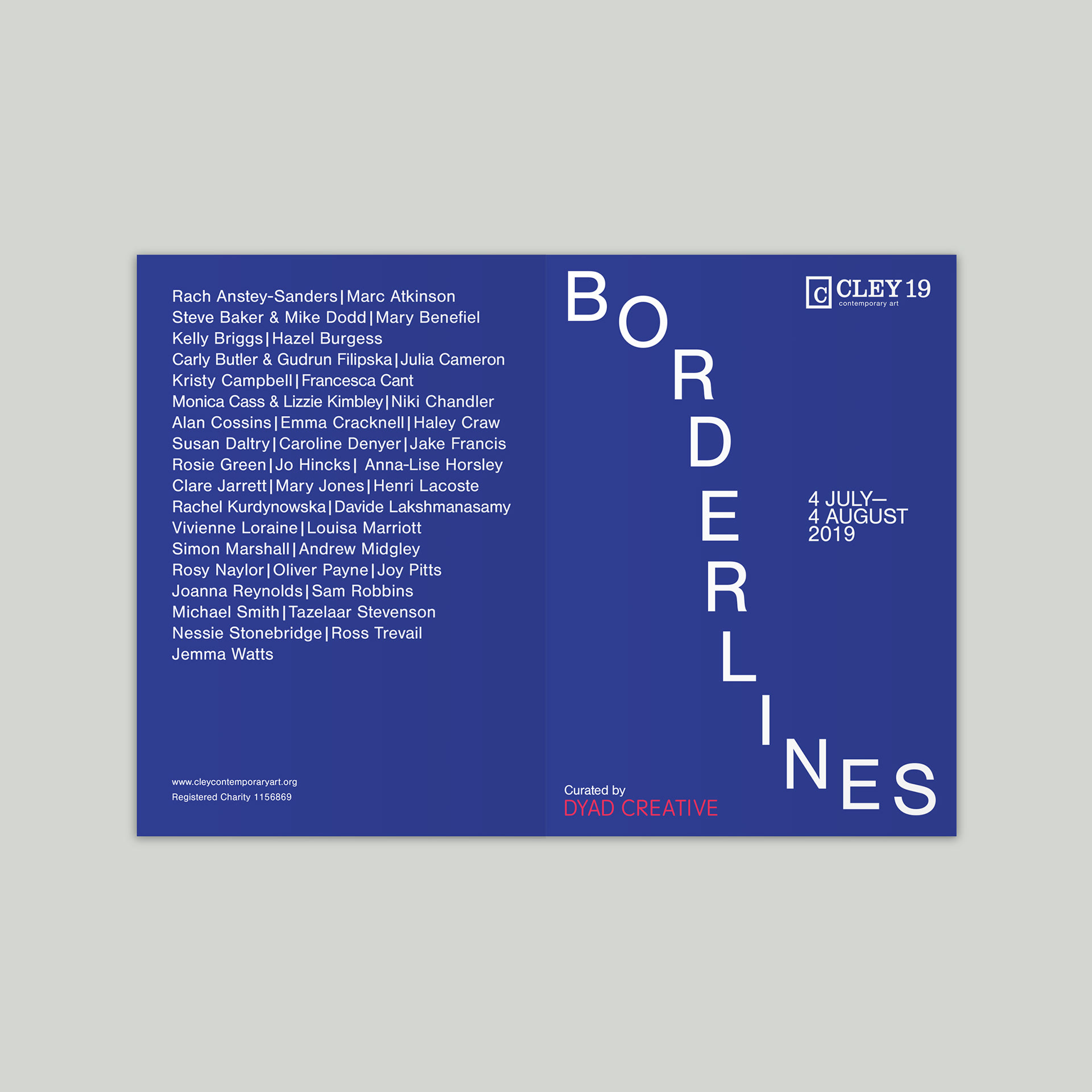
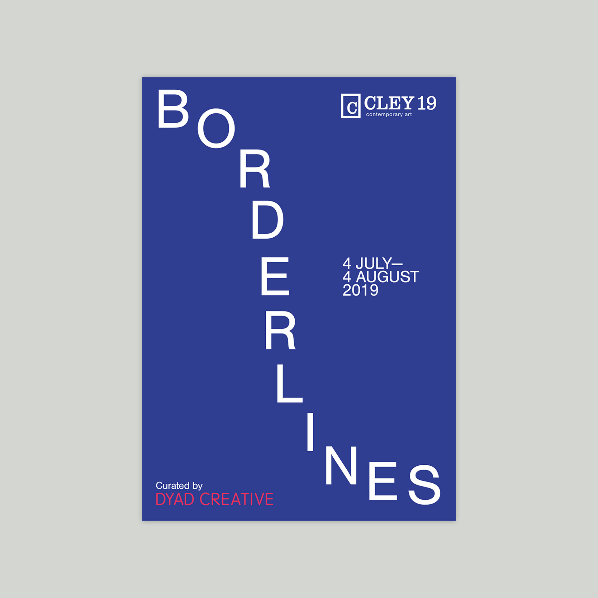
The typesetting of the 'Borderlines' text visually references the definition of the word, while not focussing on any particular themes that may be explored in the artworks and performances. Working with Dyad, who wanted a very clean and bold design, the snaked title was used across all printed exhibition material.
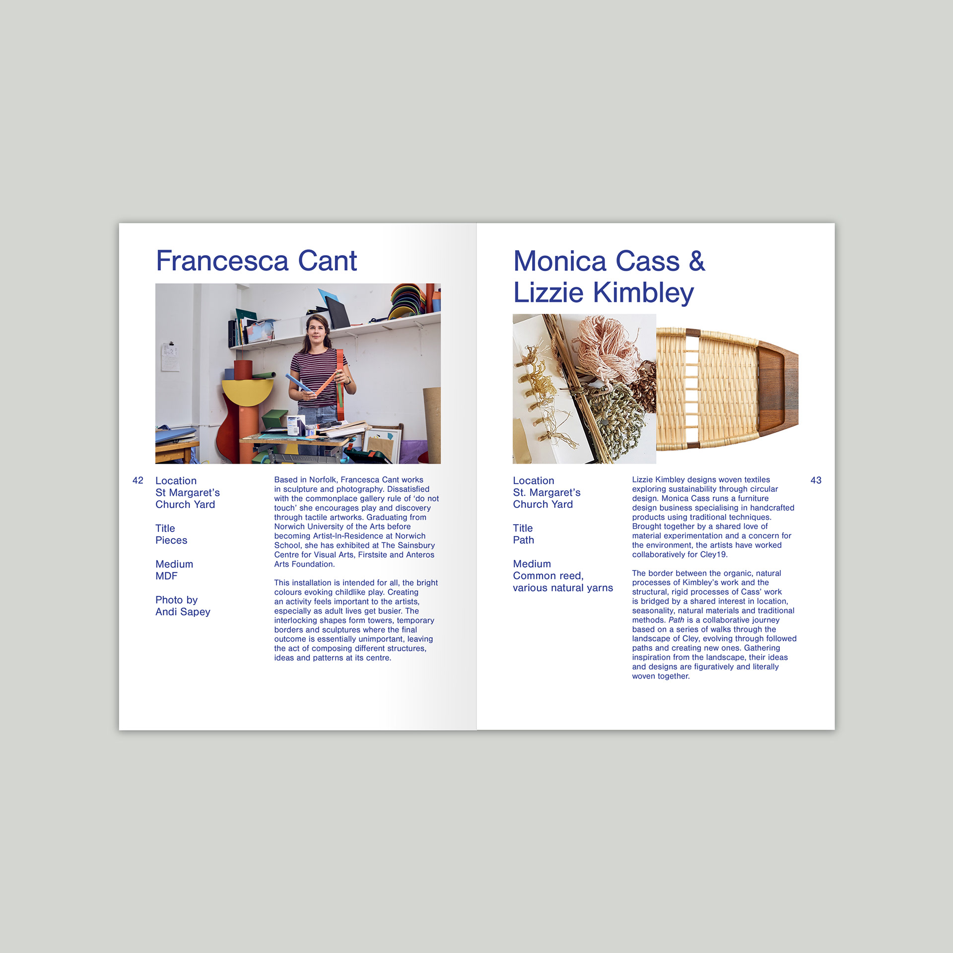
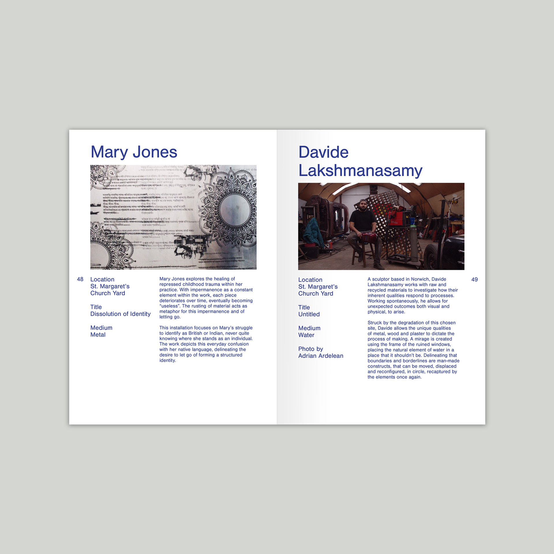
Catalogue
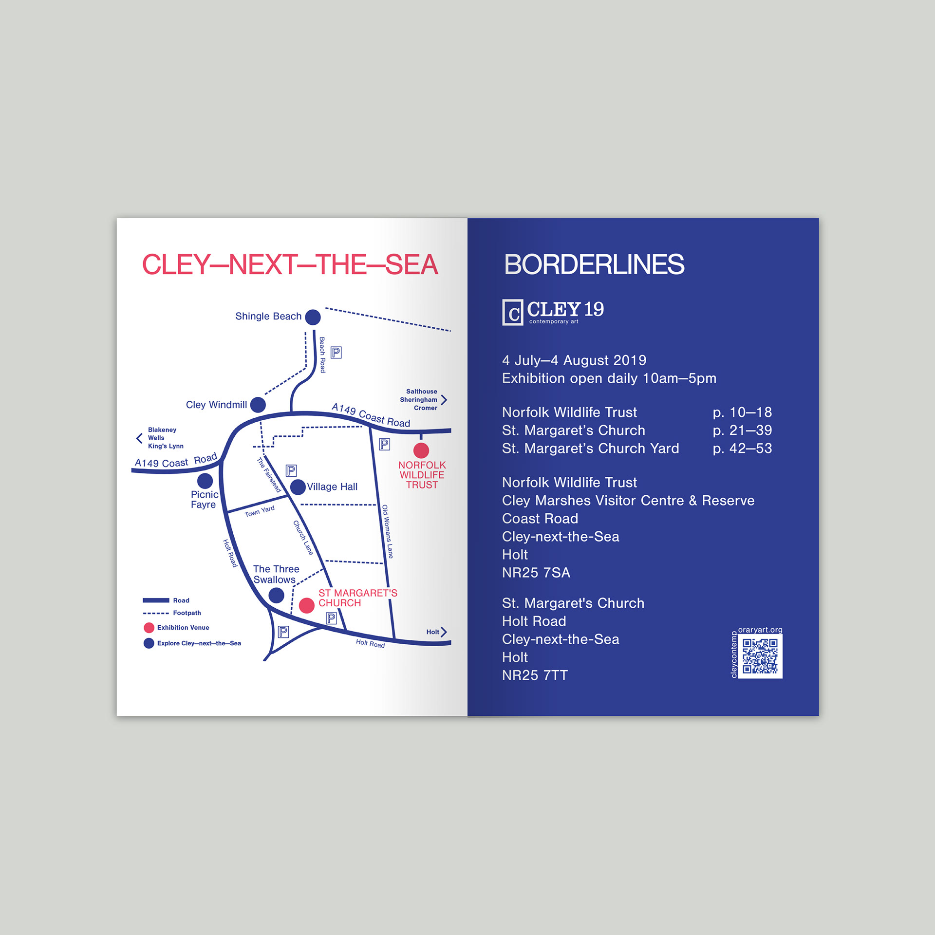
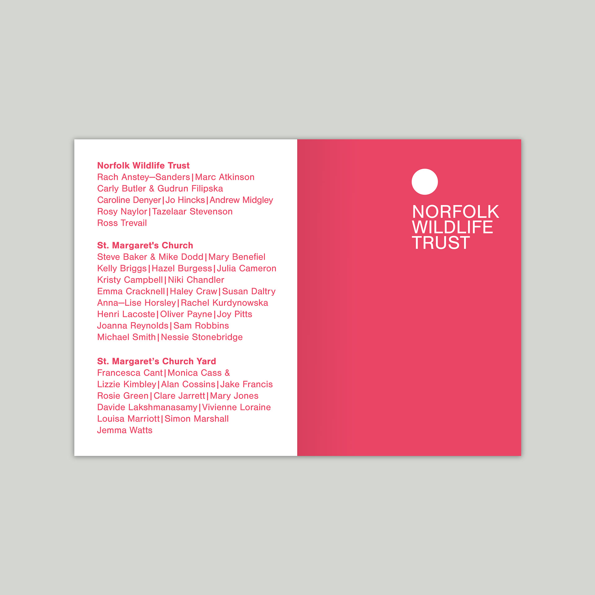
The catalogue is divided into three venues and features a title page that abstractly references its placement on the Cley-Next-The-Sea map.
A6 Invite
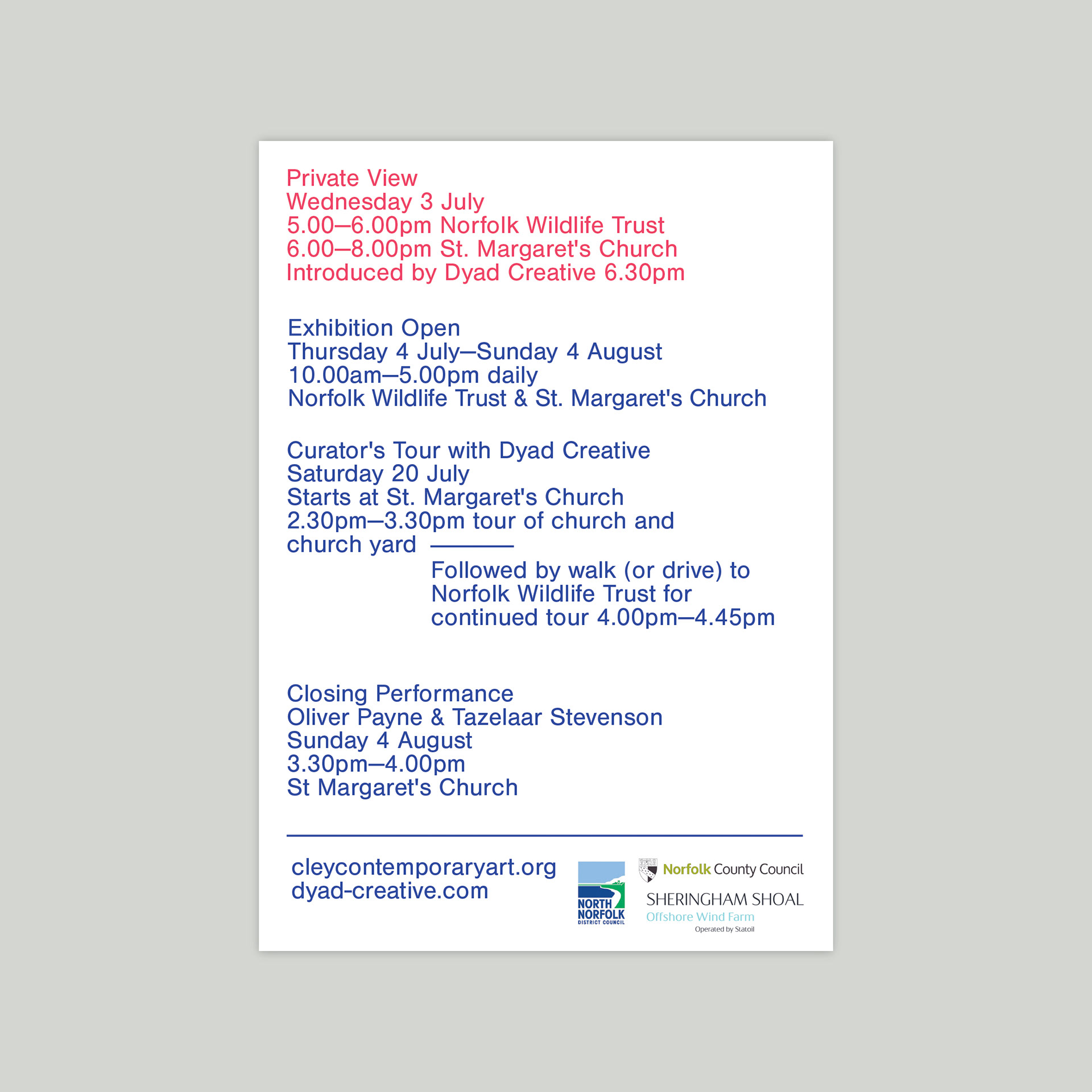
DL flyer/programme of events
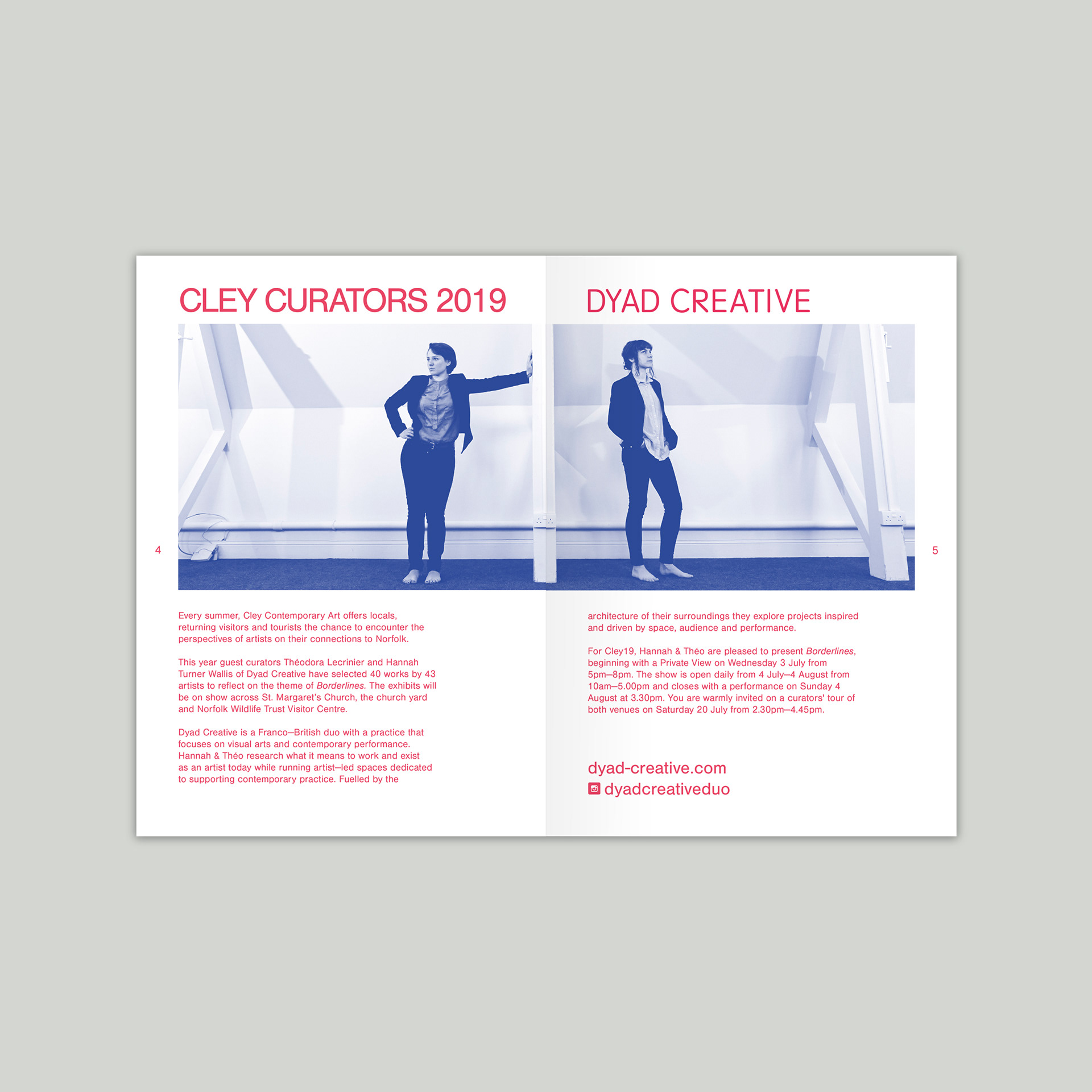
This six-page flyer contains all of the information about the village-wide exhibition. I used the duo-tone blue and red throughout all the print work, referencing Dyad's partnership while keeping the large volume of information as simple, and readable as possible.