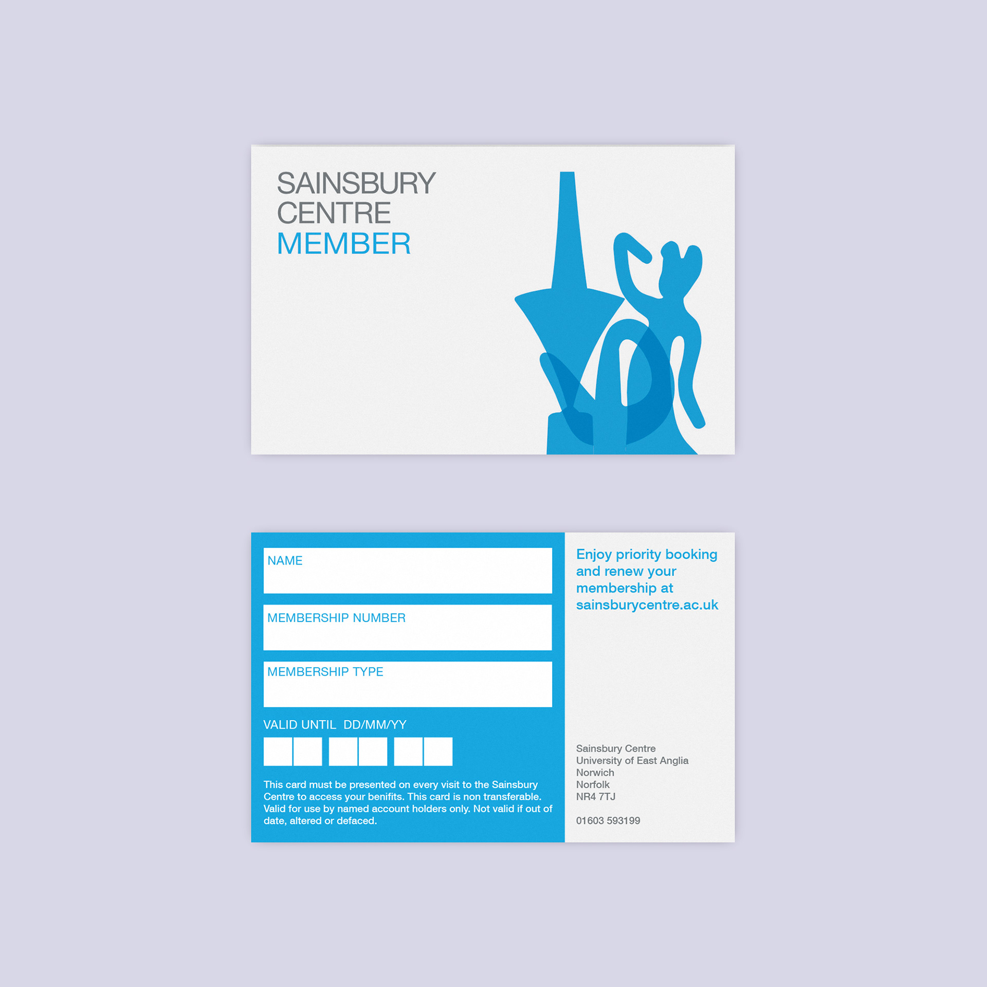
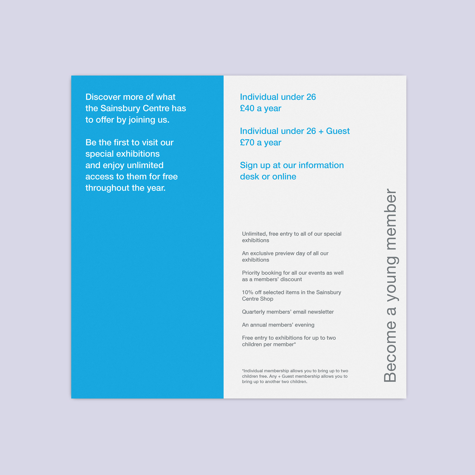
The Sainsbury Centre membership scheme was re-launched in November 2019, with new benefits and two new tiers aimed at under 25's and students.
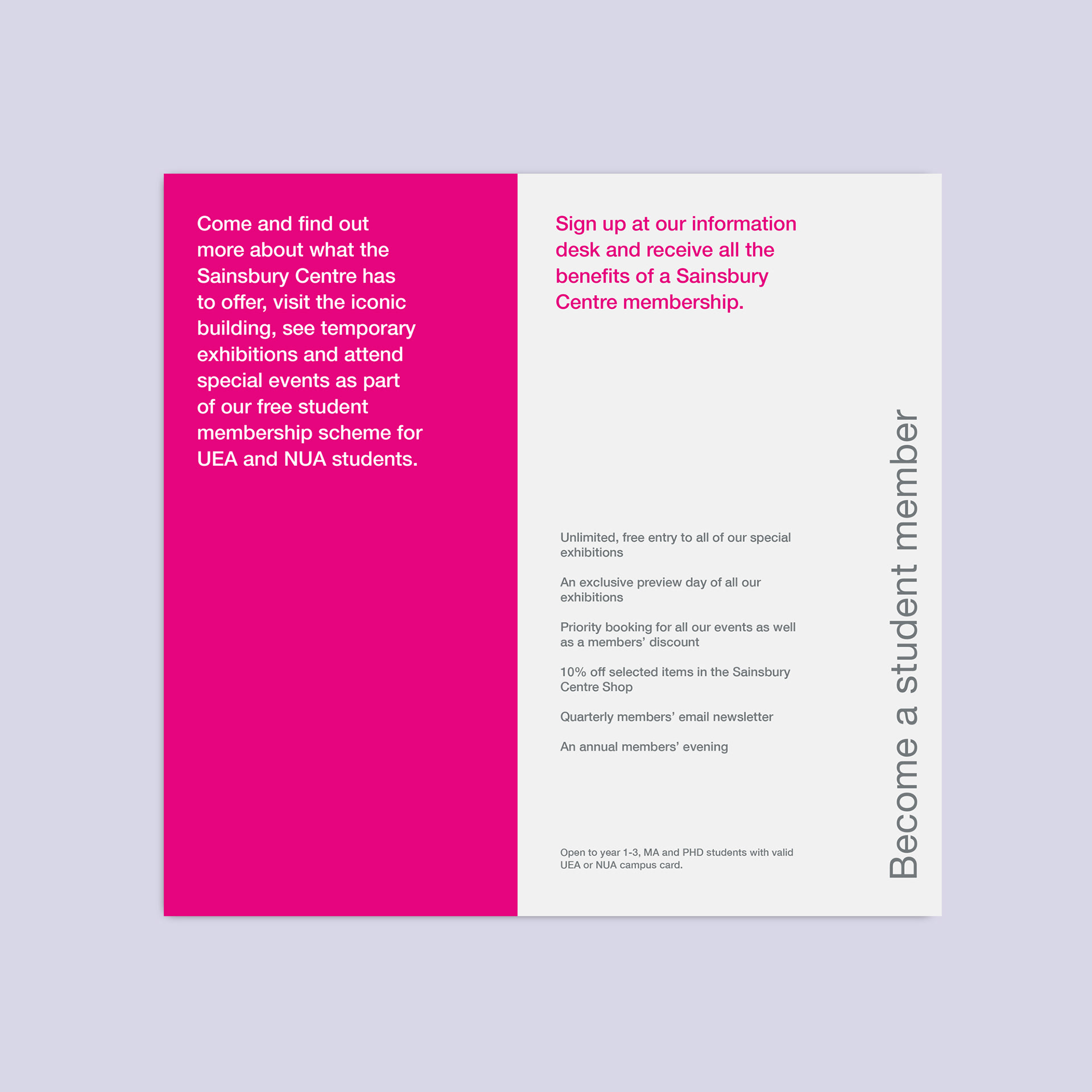
The intention behind the design of this identity was to introduce a fresh and vibrant new look in line with the relaunch of the scheme and to make it distinct among the abundance of information leaflets and flyers typically found in leaflet stands.
Previously the gallery's print work had all been photo-led with many recycled images of the gallery and did not make use of the bold colours in the brand palette. I felt that a departure from this style would benefit the scheme's relaunch and attract new audiences.
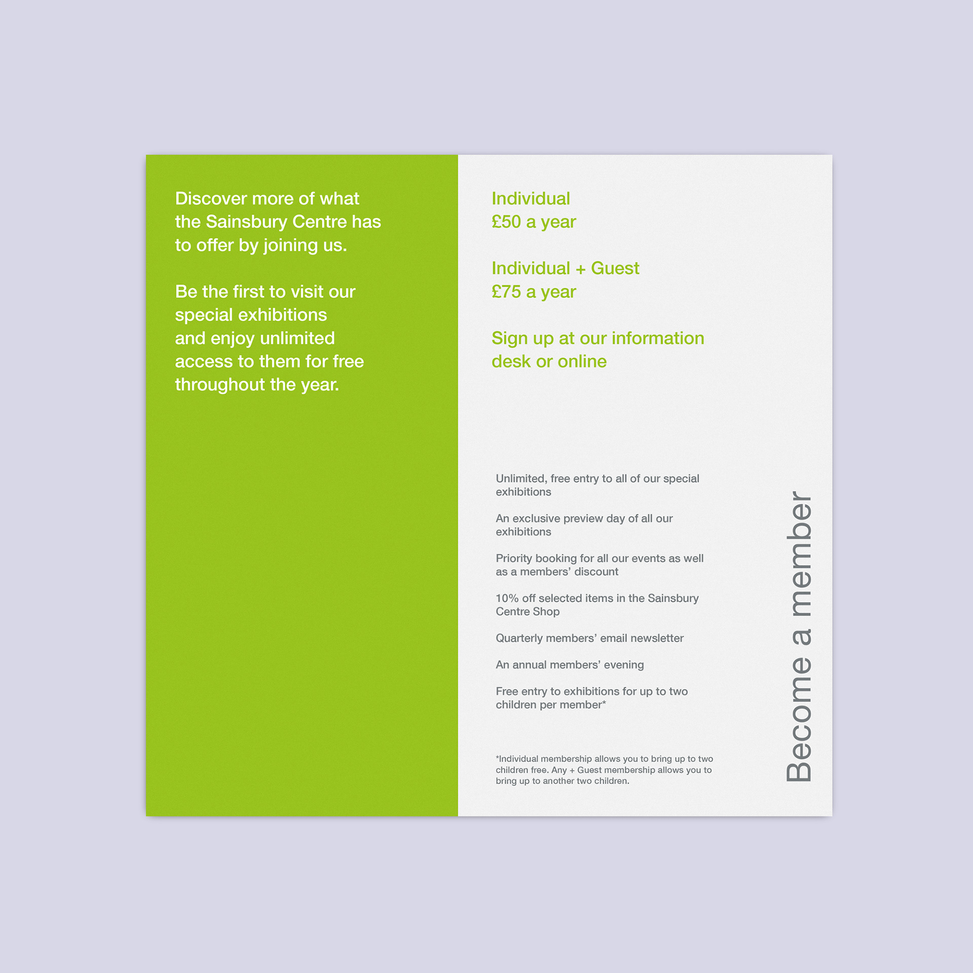
In collaboration with the Visitor Experience manager and marketing team, we consolidated the copy to its key call-to-action phrases. This simplification inspired the bold and clean illustration that accompanies the text.
Printed on 350 GSM card and placed in a clear position at the desk, these are as much a collection of leaflets as a shoppable product.
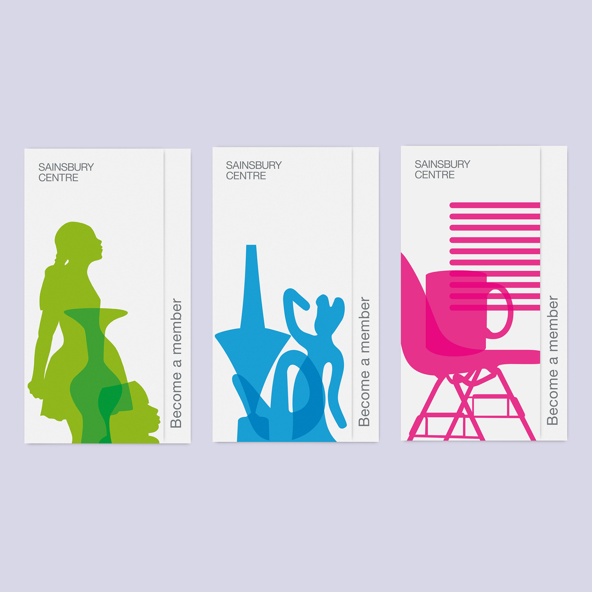
Each membership type uses a colour from the Sainsbury Centre brand palette to differentiate between them. The Illustrations feature recognisable silhouettes from the Sainsbury Centre gallery, renowned for its ceramics and sculptural collections. The student leaflet suggests the gallery as a social space and references interior and architectural features, as many students use the gallery to study or to meet friends for a coffee.
The colour scheme and illustrations are followed through to the membership cards.
