I have designed a diverse range of exhibition merchandise for the Sainsbury Centre, working closely with the gallery shop manager, artists, and artists' estates.
My work spans from collections of exhibition merchandise to bespoke products, all tailored to complement each exhibition’s visual identity whilst ensuring commercial viability.
Each project involves a detailed design process, from initial concept development to final production. I consider factors such as material selection, print techniques, colour palettes, and product functionality to create designs that are both visually striking and practical for visitors to purchase and use.
Throughout all of my exhibition merchandise projects, my focus is on combining strong visual storytelling and production feasibility to create engaging, well-finished designs that resonate with visitors and reflect the essence of each exhibition.
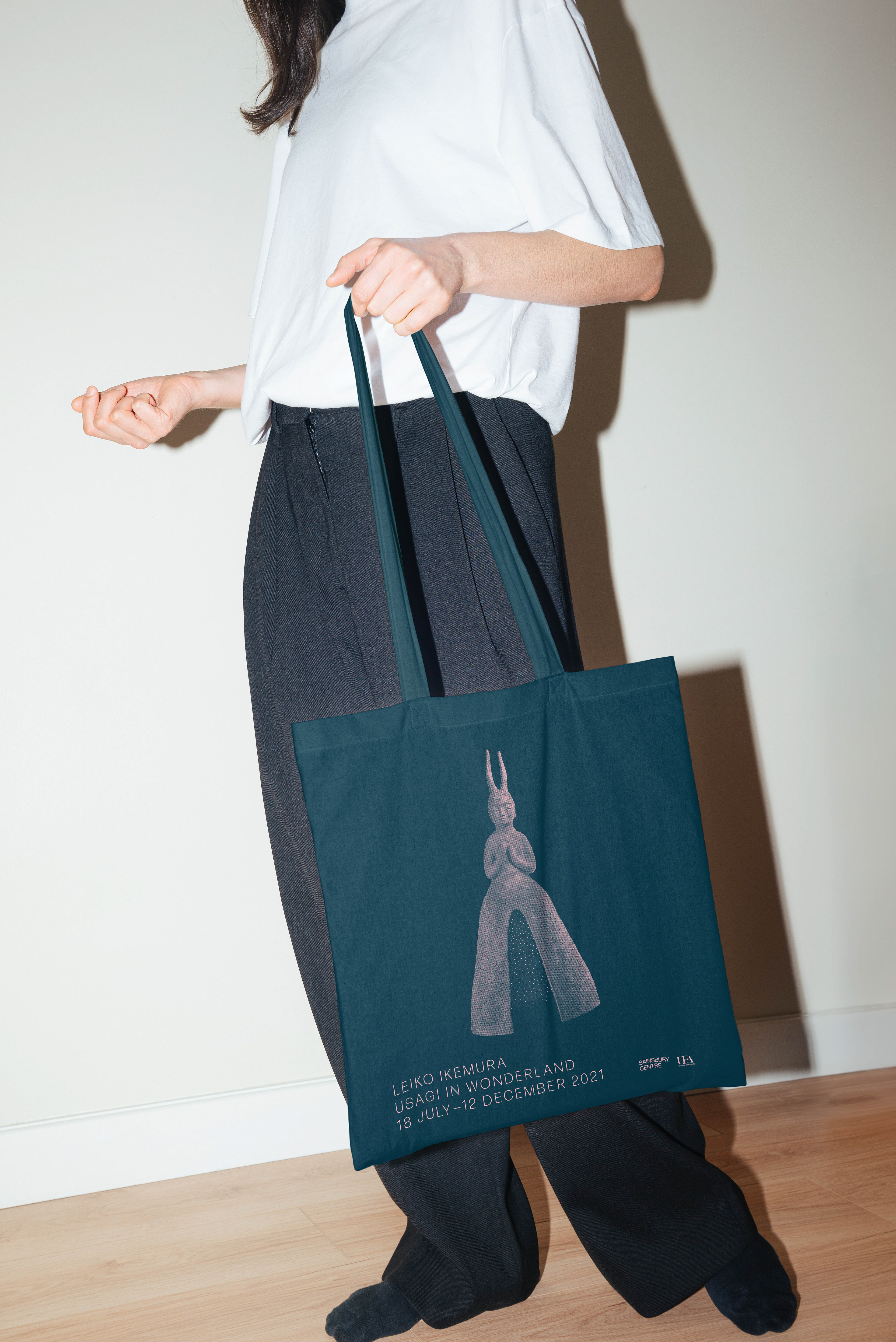
Leiko Ikemura - Usagi in Wonderland
I developed two die-cut designs inspired by Leiko Ikemura's sculptural work, introducing a 3D element to the paper product range. These designs required close collaboration with both the shop manager and printers to ensure that production methods could accurately replicate the sculptural qualities within a flat, printed format.

I created a screen-printed tote bag using a two-colour print process by converting the artwork into a half-tone design, retaining essential details whilst working within the limitations of textile printing. I also carefully selected colourways in alignment with the exhibition’s design guidelines, ensuring the final product remained cohesive with the overall visual identity.

Art Deco by the Sea
I designed this exhibition tote bag drawing inspiration from the bold, graphic style of 1930s LNER travel posters. I created an original vector illustration, maintaining the clean lines and distinctive aesthetic of that era, whilst modernising the layout for a contemporary audience and incorporating typography. I also liaised with printers to determine the most suitable fabric and ink colours, ensuring the final product captured the vibrancy and authenticity of the original travel posters.

For the exhibition notebook, I recreated the cover of a 1930s Blackpool Casino cocktail menu, a significant piece featured in the exhibition. To achieve an authentic reproduction, I developed a precise vector illustration, carefully recreating the offset print effect of the original design. I designed the notebook’s endpapers, typesetting the cocktail menu as it appeared in the 1930s, sourcing historically accurate typefaces.


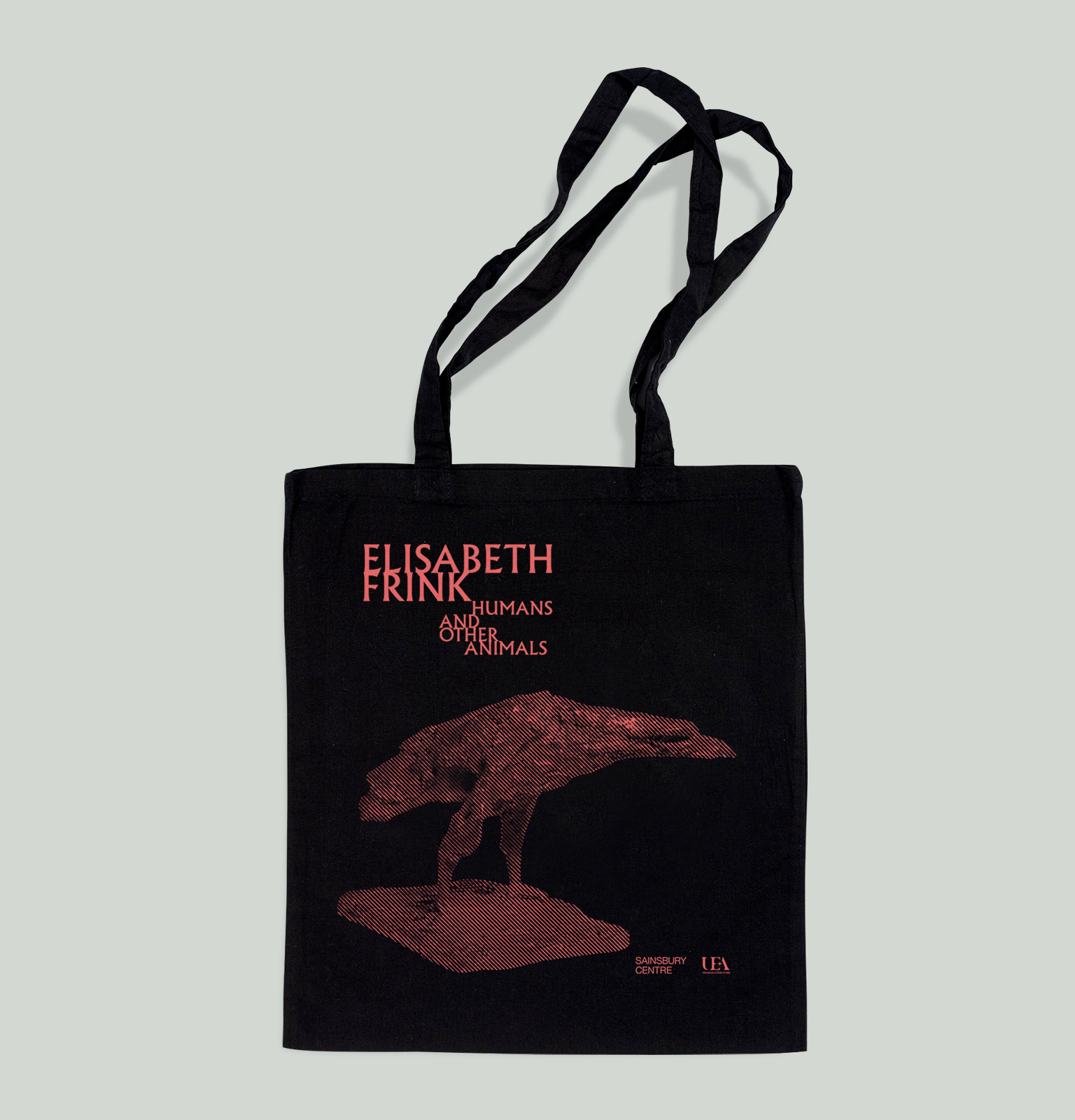
Elizabeth Frink: Humans and Other Animals
The exhibition design for Humans and Other Animals was influenced by midcentury fiction book covers, most notably that of Faber & Faber. I referenced the dark palette used by the designer in this tote bag design, which features one of Frink's most recognisable bird maquettes. I used a halftone effect to add texture that would have been seen in print work of the time. The crow acts as a representation of the themes in the exhibition due to its textural surface and ominous look.
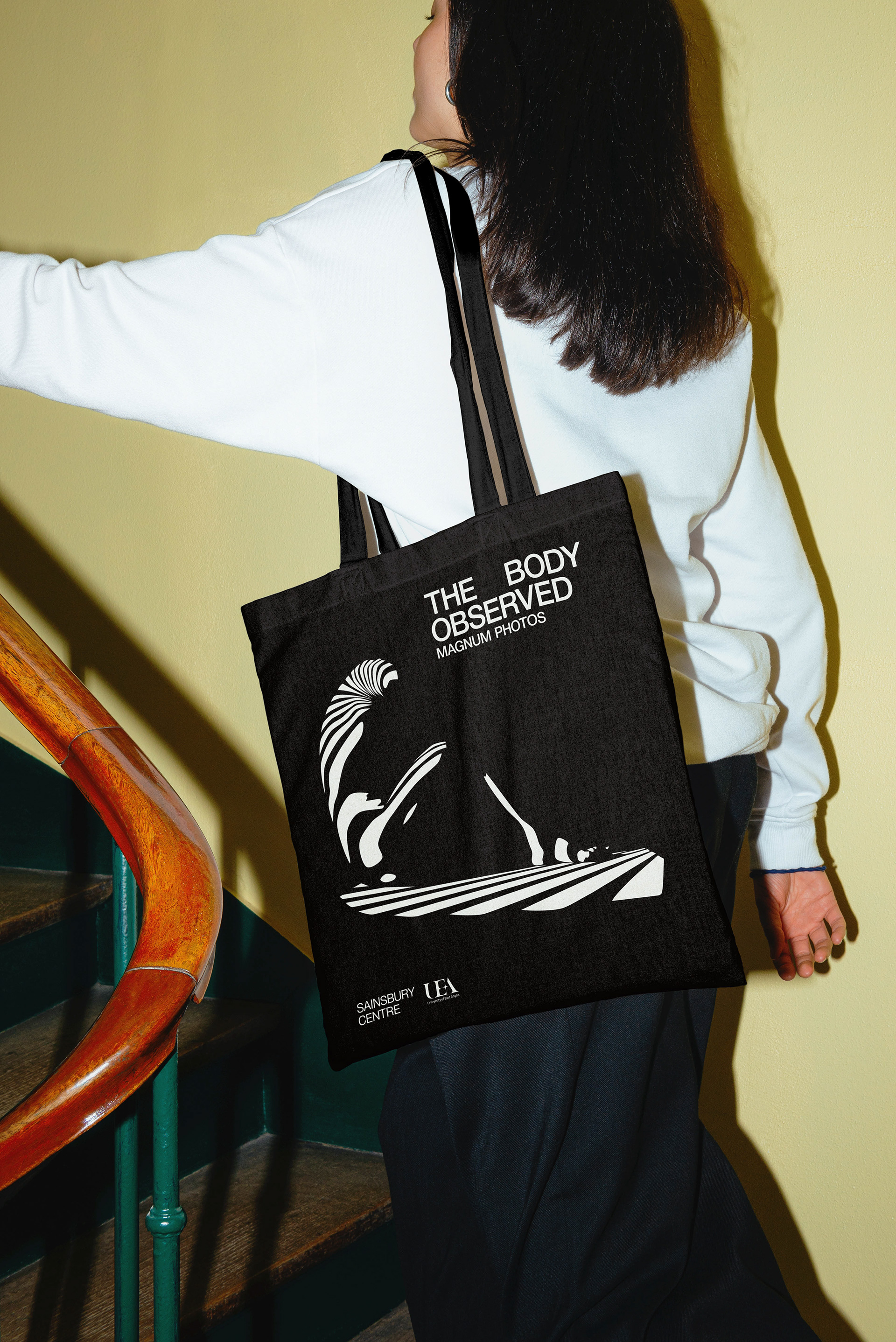
Magnum: The Body Observed
This exhibtion explored the body through images by Magnum Photographers that examine a range of subjects from identity, intimacy, sexuality and ritual, to voyeurism and performance. I created the illustration as a vector from a photograph by Werner Bischof: Zebra woman, 1942.